Our live, real-time impact dashboard will be pivotal to how we reach, inspire, and support more young people than ever.
This sector-leading live dashboard allows anyone to see in real-time how our trips help improve young people’s mental wellbeing. The data can be filtered in different ways to see the change made for different groups.
Over the past three years we have been working with social impact specialists, Trust Impact, to put impact at the heart of our strategy, developing a new Theory of Change and helping focus our impact measurement on improving wellbeing, leading to the ability to believe in a brighter future.
The dashboard is powered by a set of seven questions, which are automatically sent to every young person taking part - two weeks before they go on a trip, immediately after the trip and three months later.
We can use this data to improve what we do, to understand what questions we need to ask ourselves to deliver impact for all to make an even bigger difference to more young people.
The purpose of the dashboard isn’t to prove or disprove what we do works. It’s about the level of confidence we can have in how much our trips contribute to improvements in young people’s mental wellbeing.
We can use this data to improve what we do, to understand what questions we need to ask to deliver impact for all to make an even bigger difference to more young people.
Measures have been selected to track changes over time in impact so we can be confident the changes are attributable to our trips and support (in line with third sector standards of evidence).
This is important because while we know we won’t ever be the sole reason someone’s wellbeing increases or decreases after a trip, we can be confident a significant part of the changes is down to our work because:
Our confidence in our contribution to, and impact on, young people’s wellbeing will increase as we get more data this season, and year-on-year after that, and patterns and trends will become more apparent and meaningful over time.
The dashboard comprises 4 pages, each telling a different story of our impact. We are interested in if wellbeing data changes are consistent for all young people. We also want to understand where we don't see a change in wellbeing, or even see it decline.
As soon as a young person submits a response to one of their pre or post trip questionnaires, the dashboard updates in real-time so whatever is on our website is live reporting of our impact.
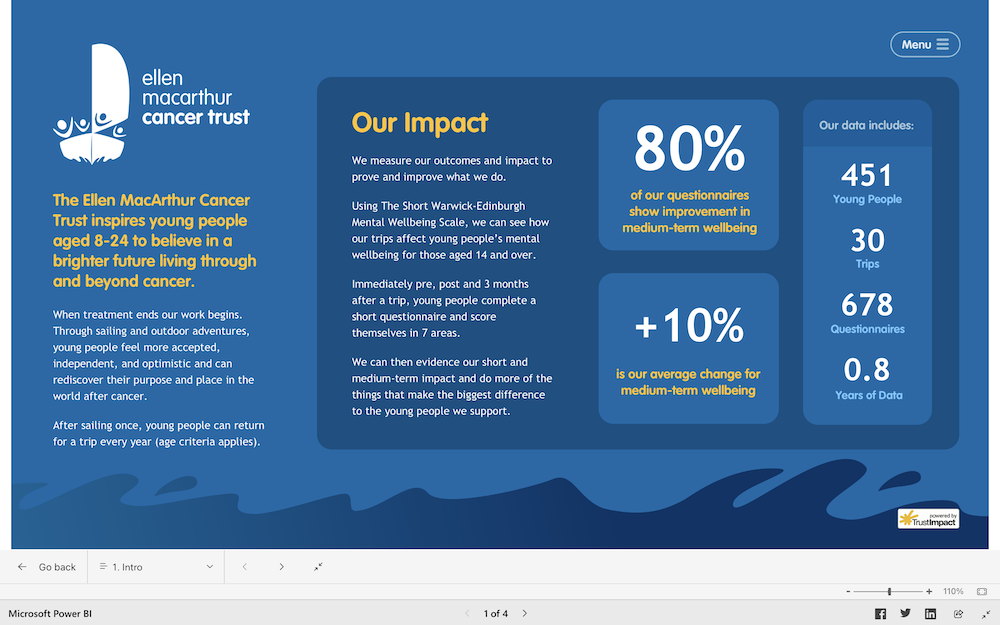
Page 1 - provides a brief introduction to our data collection and measurement process, and you can see how many young people the dashboard measures, over what time period, and the number of trips.
Page 2 – starts diving deeper into the headline stats. We’re using a validated wellbeing tool - Short Warwick Edinburgh Mental Wellbeing Scale - to measure change in wellbeing and identify drivers to improve wellbeing, such as self-worth, connection, etc.
This is a powerful and academically robust tool, used across a range of settings, including healthcare, education, and community settings with people aged 14+.
On the right, the levels of wellbeing data graph weights young people's scores against average population data wellbeing scores.
On the left, the average questionnaire scores shows the change between pre, post and follow up trips in the seven wellbeing question areas.
Page 3 - focuses on changes in short term wellbeing scores - the difference between the questionnaires sent pre and immediately after the trip.
Page 4 - focuses on how we sustain wellbeing in the medium term, through data taken three months after the trip.

Please note: When filtering the data on page 4 it is currently returning some very small sample sizes that should be read with curiosity but caution. Once we get more responses on medium term impact, we will be able to have greater confidence in this data and the trends we see.
The purpose of putting a live, real-time dashboard on our website for all and anyone to see at any time is transparency.
Impact data in the charity sector has typically been in long, retrospective, or meaningless evaluation reports that quickly become outdated or forgotten. That was absolutely us four years ago!
The dashboard now puts data at the heart of our decision-making.
Please have a play with the dashboard and start familiarising yourselves with what’s possible.